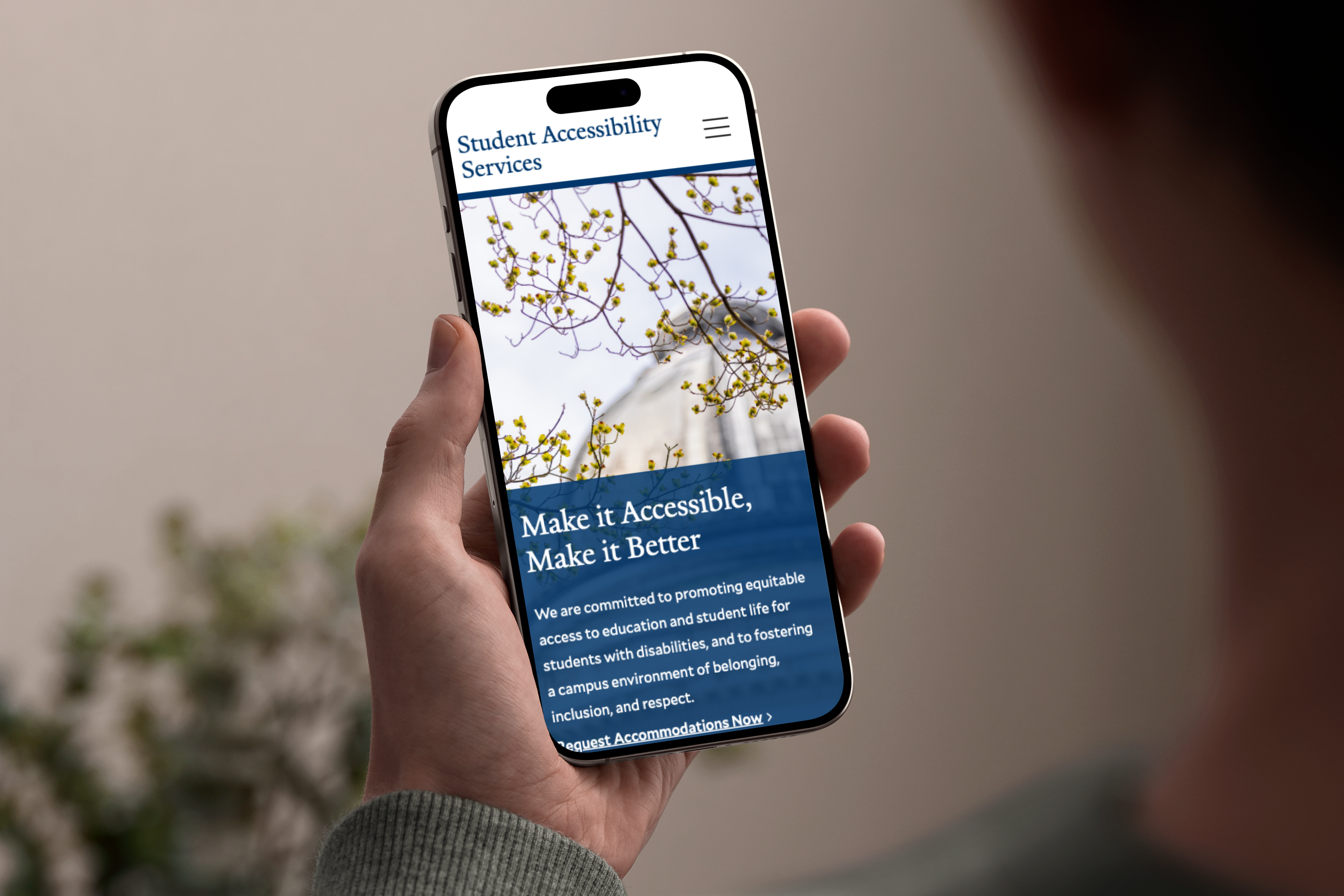
Unifying Yale’s Digital Presence with a Thoughtfully Crafted Design System
I led the team as the Creative Director, working alongside a UI designer and a frontend engineer from my team at Four Kitchens while teaming up with a UX designer and an accessibility expert from Yale.
A design system was born, and it delivered the following:
- A suite of design tokens that define Yale's digital brand and provide flexibility for future digital projects—web, react, iOS, etc.
- A library of adaptable and customizable components is available in their CMS. Each component was thoroughly accessibility tested with automated tooling and direct user testing with people with disabilities.
- A theming system that gives users choices in how their site looks while maintaining Yale's brand. Giving users the ability to choose how their school or department site looks has increased the adoption of Yale's centralized site service.


